
My Role
Teams
Design, Product, Dev, Business
Timeline
6 months
Focus
UX Design, UI Design, UX strategy
Comcast's sales agents utilize a phone line transfer service on an internal platform that was in need of modernization. The existing line transfer workflow required lengthy workarounds, which often caused incorrect billing and frustrated users.
At the same time, we were seeing a sharp increase in line transfer requests in the Care & Retail section of XM360. Since the workflow had not been updated in years, there was a clear need to rework the line transfer process. The timing made it urgent. Line transfer requests in Care & Retail were climbing sharply, and the team had no scalable way to handle the volume on a workflow that was already breaking under normal load.
User problem
Reps had to navigate unclear steps, work around system gaps, and manually verify billing adding significant cognitive load and error risk to every transfer.
Business problem
A sharp increase in line transfer volume collided with an outdated, unreliable system, which created a growing operational risk and rep frustration at scale.
~40 %
Estimated reduction in billing mismatch errors
Fewer manual workarounds
AHT
Lower Average handle time for reps doing line transfers
Linear flow vs. workaround
1 model
Scalable design framework powering fast-follow
Reuse built in from day one
Experience goal
Make line transfers clear, linear, and error-free for reps eliminating the need for workarounds or manual billing checks.
Business goal
Handle the rising volume of transfer requests reliably at scale, while laying the groundwork for the Business Line Transfer fast-follow.
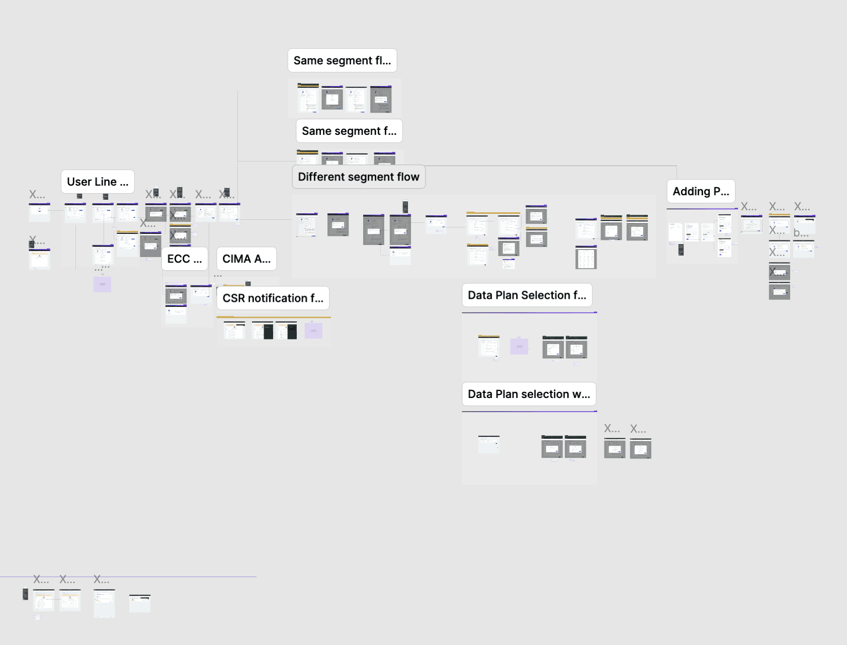
The first step was understanding what actually existed. With limited QA access, we had to pull documentation from multiple teams, fill gaps through direct conversation, and build a picture of the end-to-end flow that no single team had in its entirety. This required extensive time in building a journey map of the product to its entirety. Initially, the business team had conflicting view points of the line transfer journey and it led to multitude of revisions for my team.
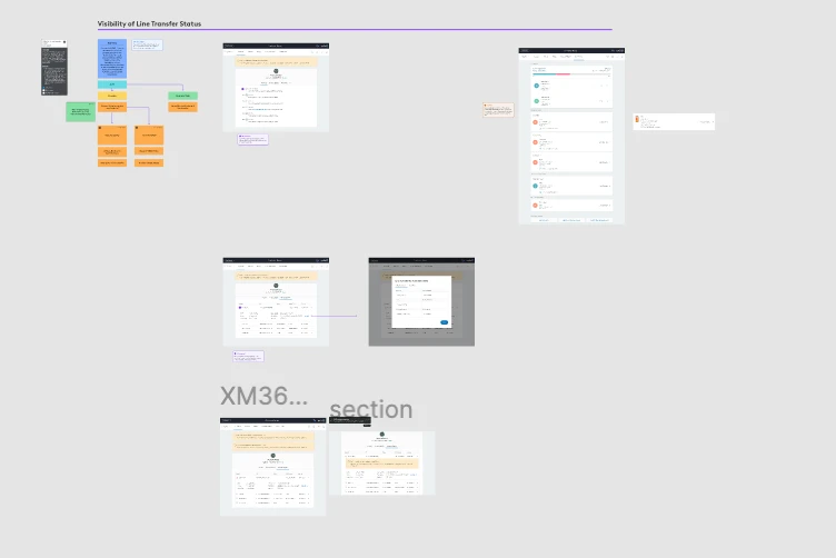
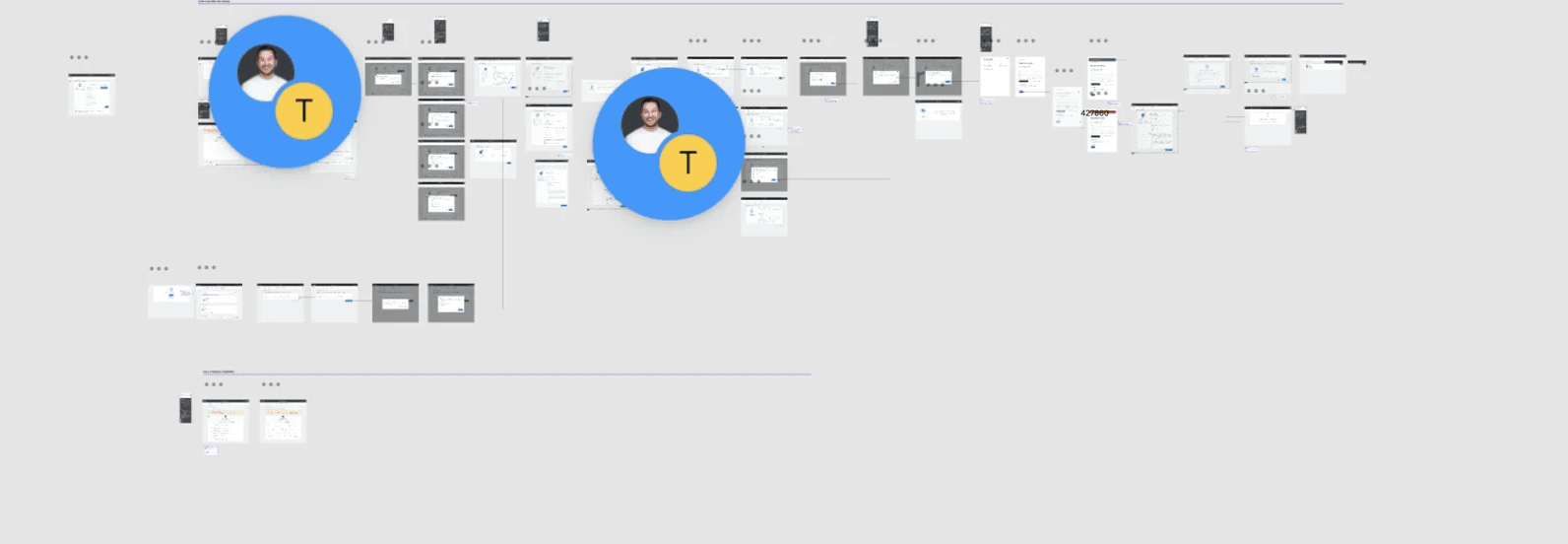
A centralized source of truth
To remain nimble and aligned with business goals, we jump into hi-fi designs early on, while simultaneously mapping the feature. This required us to gather requirements while we were already iterating on polished designs. This process allowed us to make decisions quicker
As requires shift, I balanced input across the Development, Product, and Design teams. We were beginning to face issues such as UI elements getting flagged at handoff and development constraints due to our aggressive timeline.
To organize the teams, I introduced a banner system within Figma. Adding a layer on top of each screen, we were able to track the status, change requests, who raised it, when, and the level of effort involved.

Launch
The redesigned flow is live in Care & Retail , replacing the patchwork experience with a clear, linear, validated workflow that guides reps through every step.
Scalable model
The design approach, banner system, and documentation templates are the foundation for the Business Line Transfer fast-follow. The next cycle starts with the work done.
Partnership reset
Design went from reactive to proactive. The review model and documentation standards introduced on this project have been adopted by the broader team as the new baseline.
Error risk reduced
Inline validation and a simplified, flow removed the primary causes of billing mismatches; replacing manual workarounds with guided, system-supported steps.
Visual Design
With the interaction model validated, the existing component library didn't cover what this flow needed — so I built a set of new components from scratch, each one adhering to Comcast's brand guidelines rather than adapting something off-the-shelf. Validation states, error messaging, and step indicators were designed specifically for the transfer flow's failure points, not retrofitted from a generic pattern. Every visual decision stayed inside brand constraints, but the variant components themselves were purpose-built for this project.