
My Role
Teams
Design, Product, Dev, Business
Timeline
6 months
Focus
0-1 Design System
PPL Electric's design system had been built for a team of five. It met most needs previously through shared context and verbal convention. As the organisation restructured and the team grew, those informal rules weren't communicated consistently.

The system ran on Atomic Design. The model is sound in principle, but at PPL it had one critical failure point: the boundary between molecules and organisms was subjective, undocumented, and unresolved. There was no designated design system designer, so designers couldn't agree on where things belonged once they finished new features.
The scaling problem
Atomic Design's implicit rules survived at five people through conversation. The moment the team grew beyond that room, the system stopped working.
The trust problem
No documentation meant every component decision was a judgement call. Judgement calls at scale produce the inconsistency and bugs that show up in development.
~200 hrs
saved per team per quarter
Reduction in design time with reusable components
~47%
Decrease in design-related bugs
in development
Consistent predefined component use
80%
Cross-functional satisfaction with design–engineering collaboration
Surveyed post-launch with internal designers
Experience Goal
Any designer, new or existing, can find and use the right component without asking anyone, guessing, or getting it wrong.
Business goal
A single source of truth that reduces design time, cuts dev bugs, and scales across every team, platform, and ecosystem.
Before redesigning anything, we needed to understand exactly what was broken and why. A full audit of the existing system confirmed what managers had flagged.
Naming & tagging
Inconsistent conventions across components, interfaces (mobile, iOS, desktop), and contexts. No reliable pattern a designer could follow to find what they needed
Information architecture
The Atomic Design model created subjective categorisation disputes. With no documentation to resolve where a component belonged, designers had to guess.
Documentation
There was no component-level documentation that existed. Every usage decision was made from memory or passed verbally.
The audit wasn't just visual — we interviewed managers and key designers to find what was breaking their workflow day to day. Those conversations, more than the visual audit, drove every IA decision that followed.
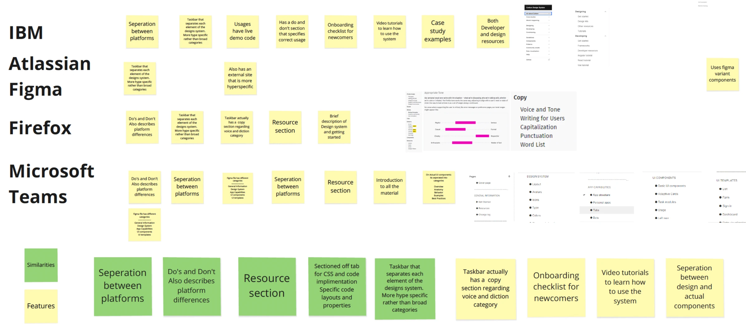
Once there was a clear picture of the pain points, we analysed other design systems such as Google Material, IBM Carbon, Atlassian, and Microsoft Fluent to find structural patterns that would fit our needs. This produced a matrix of categories that became the new information architecture; one grounded in industry standard rather than internal convention, making it immediately familiar to designers coming from other organisations.

Building a single source of truth
With no existing documentation to update, we built it entirely from scratch. Every component needed a usage description, a do's and don'ts section, spacing guidelines, and context notes making employee-facing vs. customer-facing explicit. This was the most time-intensive phase, requiring constant communication between designers, managers, and UX writers to get the language exactly right.

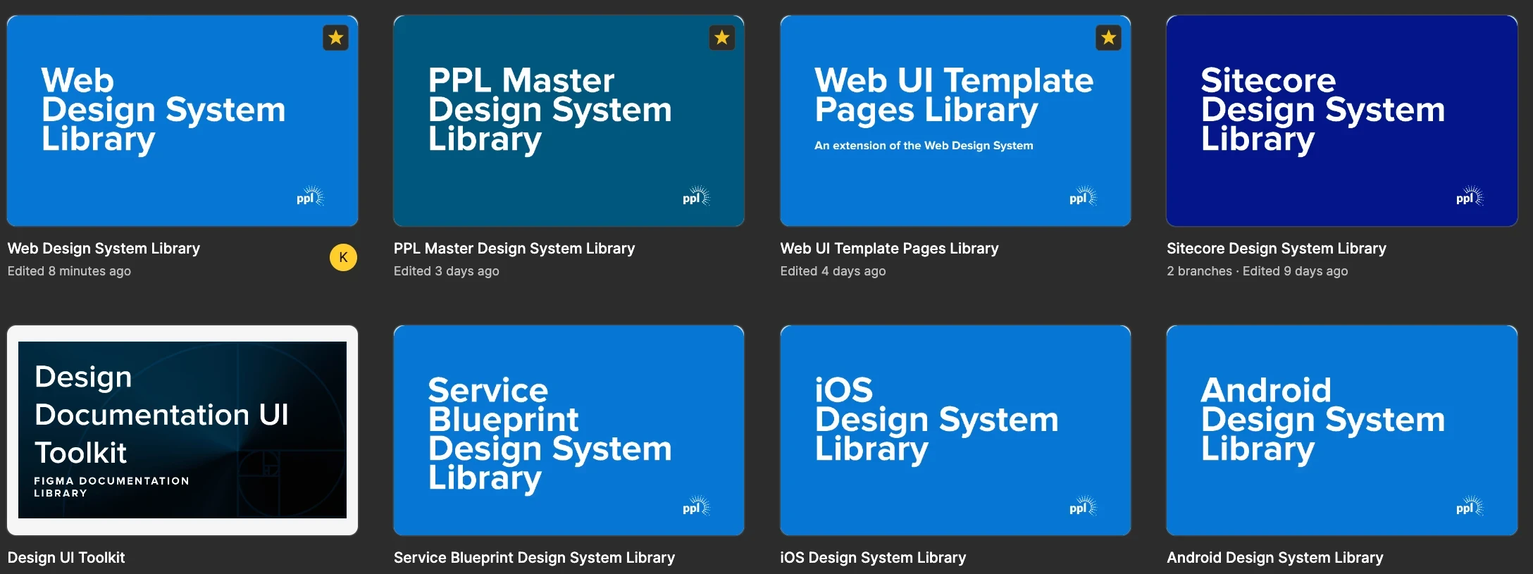
One of the big pain points for both designers and developers was the fact that everything lived in one singular design file regardless of component type; web, mobile, tablet. Identifying that designers were pulling in the wrong components in their design files because of the unified system in place led us to develop a design system that was specific to the environment that was being designed for. This streamlined exactly what components were being brought into the files and greatly reduced the cognitive load for the designer.
On top of design documentation, we also had to update outdated components with new capabilities available within Figma. We began rebuilding fully responsive components by integrating auto layout. These variants also had pre-prototyped variant behaviors we had to address.


